

Showing posts with label album cover. Show all posts
Showing posts with label album cover. Show all posts
Wednesday, March 6, 2013
Monday, July 9, 2012
New! Album Covers
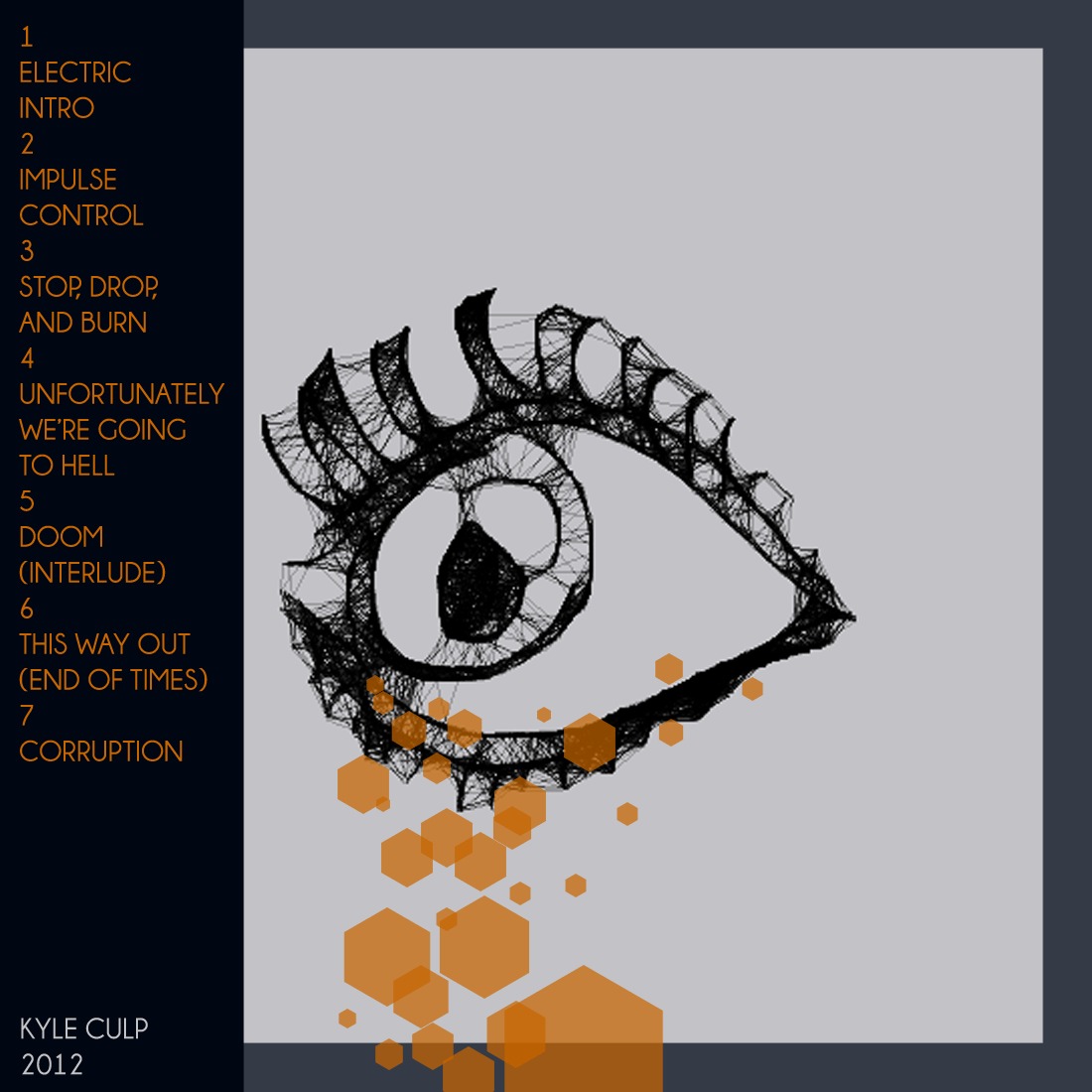
Remember that six-track EP of mine from last year? (nope)
So I've tweaked some of the songs and even added a new one. It's probably far from being a legitimate album by any means, but I feel like it's more complete now. So while I'm still actually messing around with some of the songs I've decided to make a new new album cover since the old one totally blew balls. And that's what this post is about. The album cover.

So just fucking around in photoshop this probably took a couple of hours (of messing with ideas). And hey! I decided to make a reverse side in case anyone needed track info.

So enjoy these covers and please pee yourself in anticipation of me releasing these songs again.
So I've tweaked some of the songs and even added a new one. It's probably far from being a legitimate album by any means, but I feel like it's more complete now. So while I'm still actually messing around with some of the songs I've decided to make a new new album cover since the old one totally blew balls. And that's what this post is about. The album cover.
<AS ALWAYS, PLEASE CLICK ON PICS FOR BIGGER PICS>

So just fucking around in photoshop this probably took a couple of hours (of messing with ideas). And hey! I decided to make a reverse side in case anyone needed track info.
So enjoy these covers and please pee yourself in anticipation of me releasing these songs again.
P.S.
Here's a link to the old shitty album art if you're actually interested. I do believe the link to download the album is not functioning any longer.
FUCKYEAHMUSIC
Thursday, June 16, 2011
"We Are Here" Album Covers
Awhile ago I designed some album cover ideas for the band Ladysoal. They're from Ames and their music is kind of hard to describe, but it definitely rocks. Anyway I've decided to post some of the drafts I came up with on here (they didn't get used). Again, these were just ideas, not final drafts.


Anyway I had a lot of fun working in Photoshop again, even though these didn't get used. You can check out Ladysoal at their Facebook page, or at Ladysoal.com, although I'm not sure how often that last page gets updated. Check them out and let me know if you think my cover idea(s) were a good fit for the music.
Subscribe to:
Posts (Atom)